We are digital agency that helps businesses develop immersive and engaging
We are digital agency that helps businesses develop immersive and engaging


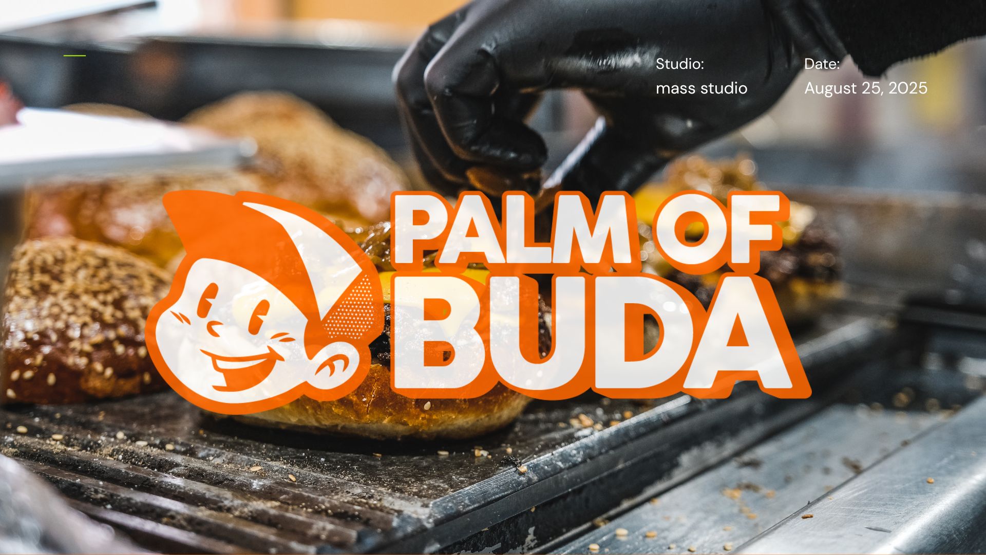

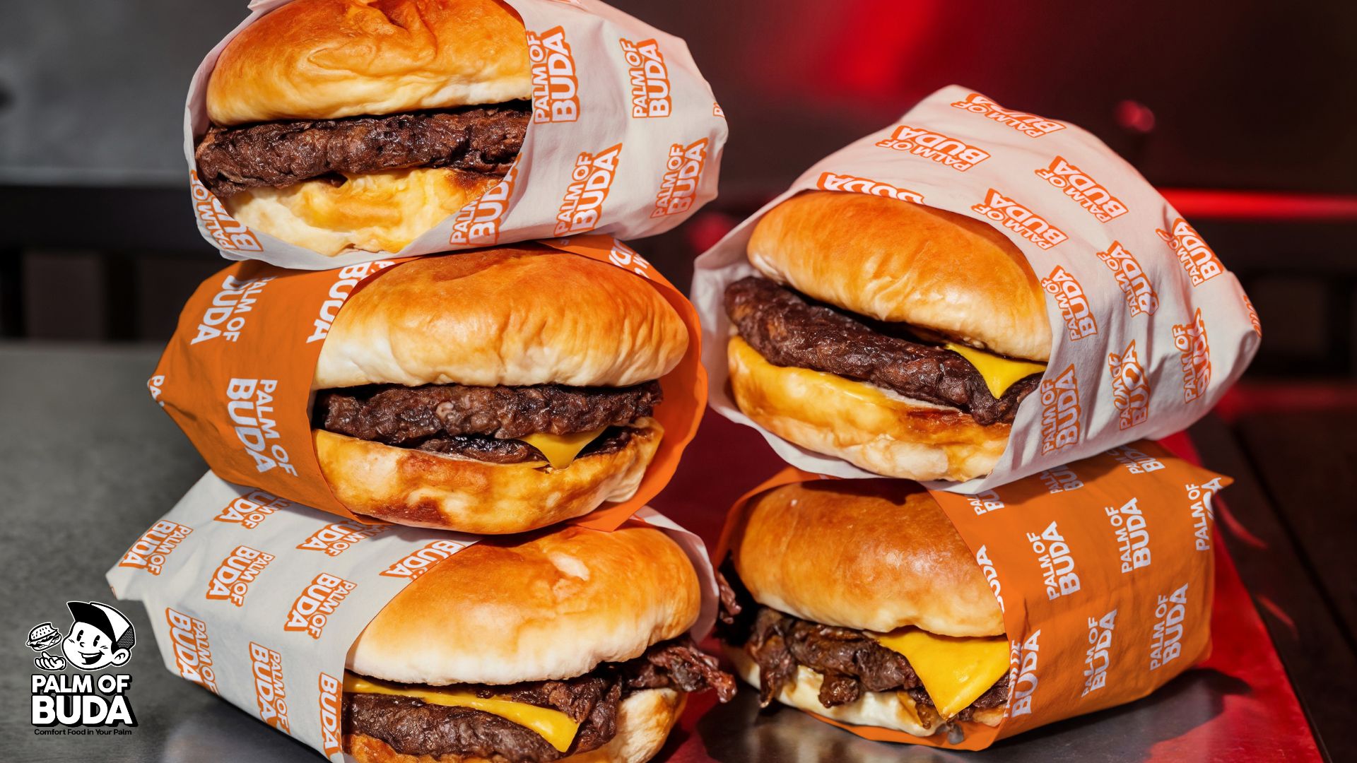
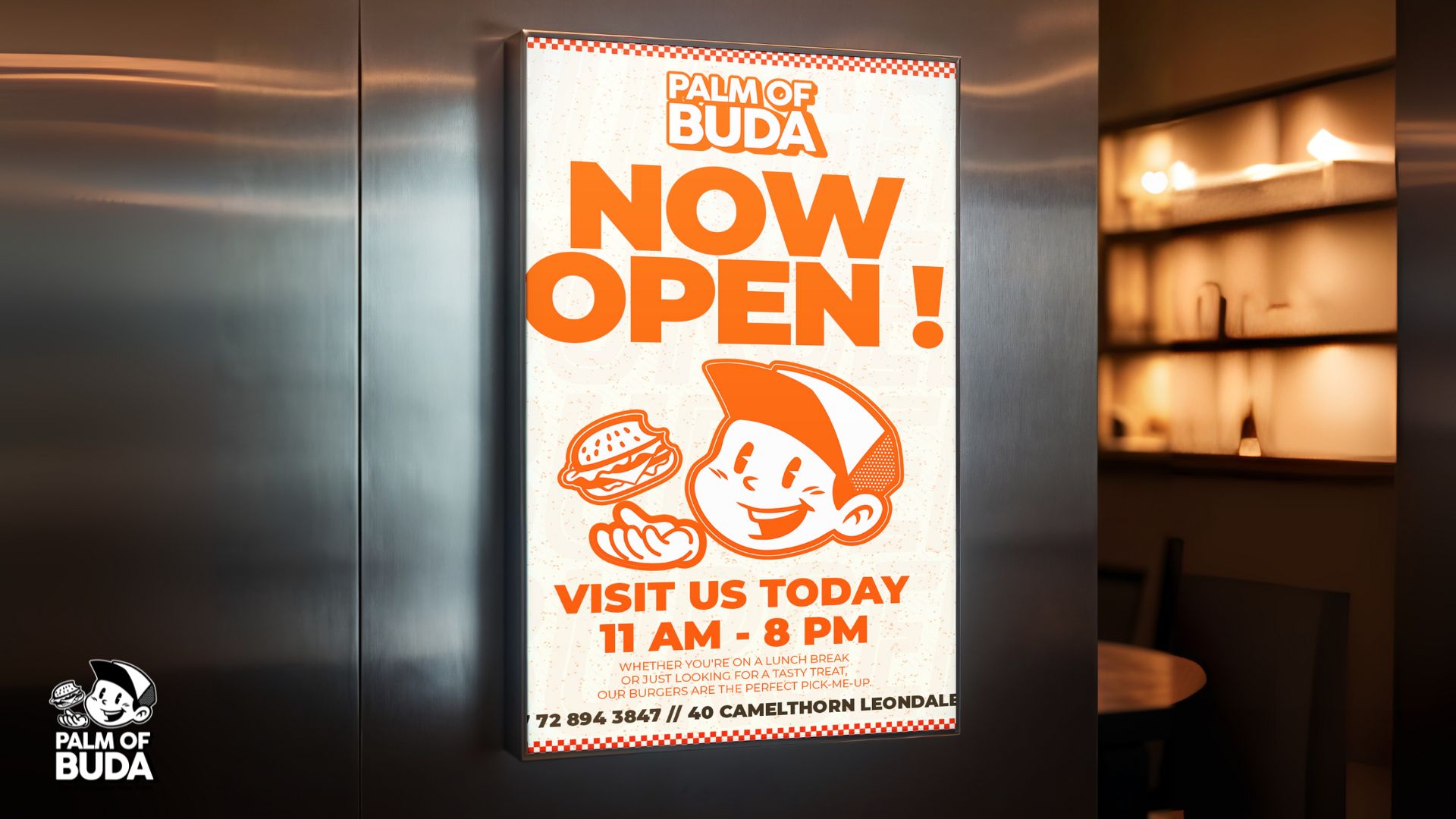
A new restaurant in Leondale owned by Sibusiso. We developed a bold, youth-driven identity that feels fresh, friendly, and unmistakably local. The system is built around a vibrant orange palette, a confident wordmark, and a playful mascot that makes the brand instantly memorable.
Primary: Brand Orange (hex to match your master brand)
Neutrals: Black and White for high-contrast type and outlines
Launch a recognisable brand that feels vibrant and premium, but still approachable for the local community.
A mascot-led identity with a bold orange backdrop, stacked wordmark for tight spaces, and clear roll-outs for menus, packaging, signage, and social templates.
A distinctive, street-ready identity that looks established from day one, communicates “fresh, friendly comfort food,” and is effortless to deploy across physical and digital touchpoints.